Monday, December 14, 2015

Unit Summary 5

Technology is everywhere, in the age of the smart phone we don't think of things like candles as technology but at one point in time they were new technology. With interior design we have to consider that technology can be features within a space as well what was used to construct the space. In this unit we talked about interior features, environmental systems as well as design technology.
Technology gives us the ability to understand design on a different level as it gives us a look at how it was constructed and why certain features are included. The use of technology in design gives us so many more options, we are able to conceptualize designs that before could not be conveyed through drawing and we can predict how materials will behave in using the new technology. Sale is also influenced by the new technology as we can push limits and have perfect the science behind it. The Roman arches were new technology that let them build bigger and higher. Technology influences the colors that can be used in a space, the lighting fixtures, the size of certain elements, the materials used, every element of design is influenced by technology.
A space can be described and defined by technology, however it rarely is unless it is considered a "Smart Space". Technology is very influential in spaces but most go unnoticed unless the technology is the main focus.  The environmental systems in a space can contribute the principals and elements as well as light and color of spaces. Technology is something that goes unnoticed until it is absent.
  

Final


Thursday, November 19, 2015

Unit Summary 4

Light and color are often very noticeable in a space. They can be used to make a space seem larger or smaller, warmer or cooler, light or heavy. The absence of color can make a room feel cold and eerie, an abundance of color or lighting can make a space confusing and uncomfortable. Light and color need to be balanced in order to make a space more enjoyable or evoke the correct response.

In this unit we looked at a few art galleries, these spaces had an absence of color on the walls so that guest could focus on the art that was being displayed. The rooms that had art on display also had lighting that was meant to direct attention to the art. The lights were mounted so that it was at the best angle to highlight the art.

Light can really manipulate a space, it sets the mood of the space and works alongside the other elements. Color contributes the tone of a space and also works along with the principles and elements. They also work in conjunction with scale as they can manipulate the perceived size of space.Space can be analyzed and described using light and color.


Tuesday, November 17, 2015

Case Study 4

The Al-Rifa'i Mosque in Cairo Egypt is made of sandstone and is situated in an area that is surrounded by other sandstone buildings and desert. I constructed my model from cardboard to simulate the qualities of sandstone. For the light test I places the model on several different color papers to see how the building would react to the color. The model really didn't do much when interacting with color, it didn't reflect the color or absorb it in any way. When i put in on my carpet which is a lighter brown and my wall which is beige the model acted just how the building does with its surrounding buildings.
For the light study I took a cell phone light that has a blue tint and mimicked the path of the sun. The Mosque is a solid structure and so I made the model very solid as well. Because of this the model cast a shadow that rotated with the light. I also tried a slightly removed artificial light, the model wasn't reflective or anything so it really just absorbed the light. I also sat the model out in semi-direct natural light and it behaved the same. The Al-Rifa'i Mosque cast a very solid shadow and absorbs the light that directly hits it.        
       Sunlight travels over 
Color becomes a camouflage 
Sturdy shadows are cast

Sunday, November 15, 2015

UK Art Museum Visual Essay


This painting uses color in an interesting way. Unfortunately it was the only item I got to photograph before my phone dyed.
The UK art museum is really a beautiful building, It blends well with the rest of campus and the auditorium inside is breathtaking when lit. The art museum portion is also beautiful the lighting is soft and gives a warm feel to the rooms. The lights hit the art works just enough so that the artwork really sticks out. The room is pretty barren of color so that the artwork is able to stand out.


This is a sketch of one of the larger display walls that are used to showcase the artwork. It is barren of color so that you can focus on the artwork. The other is a sketch of the exterior of the Singletary center.
 
The sketch on the left is the auditorium which uses light to direct the attention of the audience. the sketch on the right is of a statue that is displayed outside the art museum, the metal it is constructive of reflects the light and adds to the art. 
 
These are sketches all demonstrate how that light is used to spotlight different artworks. the lighting of the art museum is just as important as the artworks that is displayed.  

Tuesday, November 10, 2015

Newman, Singletary, SAVS


All three of these buildings have a facade that are fairly void of color but light really hits the buildings in unique ways. The SAVS building is intersting in the light because the red brick really shows through and the grid on the front creates neat shadow pasterns. The Newman centers interaction with light is really noticed in the interaction with the crucified Jesus the way the light draws attention to that really showcases the fact that it is a religious institution. The Singletary center gains more personality when it's in the direct light, the buildings angles and curves become more of the focus, also the contrast of red brick and white concrete become more present.  

Saturday, November 7, 2015

Loudon House Exploration

Creek light by Karen Spears is an amazing piece that captured my attention intermediately, from far away you can tell exactly what this picture is, but the closer you get the harder it is to tell. This painting is a beautiful swirl of colors that insistently calms you, and when you back away about five feet it becomes am amazingly vivid view of light shining through tree branches and reflecting in a creek. There is no real light in this picture but the artist used color to make it seem like light really was shining onto a creek. The was the first piece I saw at the Loudon house but it really stuck with me. The way the colors run together and imitate light make this painting feel real.  

The gallery space at the Loudon house was beautiful, so beautiful in fact that someone was having their wedding there so I didn't get the chance to see all of the gallery space. From what I did see I was impressed, of course the walls were bare so that they wouldn't subtract from the art but it was still a beautiful space. The hardwood floors were such a gorgeous color, some areas had a darker stain than other. I did notice that the windows seemed small but there was a lot of light coming in and the intricate pains of the window made them very interesting. The gallery felt very peaceful probably because the soft lighting and muted contrast of the white walls and hardwood floors.

The exterior of the Loudon House is very interesting, it is very castle like but the colors don't really fit with what is typical thought of as a castle. The white exterior and blueish green trim are used somewhat as camouflage, it makes the house fit in more the houses that are around, but the overall architecture really isn't hidden. Light is really important to this building.All of the windows really help to capture light and make the building seem less dense.
     

The Loudon House is in an interesting place, When going to the house you can tell how downtown has changed, there are some old buildings that are being converted for new uses, there are some areas that are highly impoverished, and then fairly close there are very nice homes, so it is quite odd to see the make up of the area. Also the fact that the building is in a park is interesting, right next to it is a youth center with a gym, so its really a very odd grouping. the house is just kind of existing there with out any real reason. Most art museums are in "culturally rich areas"where as the Loudon House is really isolated.

Thursday, November 5, 2015

Unit Summary 3

Materials are probably the biggest influence in design. The materials place limits on what can be achieved and the impact the building will have. The buildings that we looked at in this unit were made of a variety of materials from wood, to concrete, to glass, to plastic, the buildings were all very unique and were made this way because of the materials that were used in their construction. 
The materials help us to understand a building because it is how we conceptualize its construction. We know what the materials are so we can better understand the space. Materials can have a huge influence on the scale of a building, take the coliseum for example, because of concrete it was able to be as massive as it is. 
Material is very important to the principles and elements, it influences the lines, color, texture, sometimes even the light and harmony is influenced by the materials used in its construction. A building can be analyzed and described using material but it has be accompanied by the principles and elements as they link the materials used to the design.

  
The first image is the Long Leeds House which is constructed with brick, but the important material in the building is the glass. The large number of glass windows is what makes this building stand out and seem impressive. The second building the Parthenon, it is constructed of concrete by using this material the building was able to have a large dome with an oculus. The last sketch is the Colosseum which was also made of concrete, the arches allowed for it to be built taller and wider so that more people could use the space.

Campus Building Light and Color

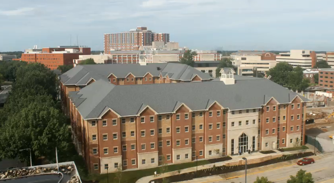
Central One has someone of a monochromatic color scheme. For the most part it is different shades of brown with some grays. This color scheme helps the building fit with the surroundings, but still highlight certain portions of the building. The light for this building during the day is really noticed in the large glass doors and the multiple widows which glint from the sunlight. At night the building is illuminated with street lights which soften the look of the building.

Tuesday, November 3, 2015

Light+ Color 1

Light and color can make a place seem soft and relaxing or intense and stressful. The use of light and color to manipulate the tone of a space is very impressive. The  Knossos Palace in Crete Greece is a perfect example of how light and color can manipulate a space. The interior has very few windows and the walls are solid stone, but the light from the ceiling and the red details on the columns makes the space lighter, it warms the space and makes it seem larger.  
https://s-media-cache-ak0.pinimg.com/originals/24/c5/8c/24c58ccae3bb817aadab61c66b4a7ca6.jpg

Canstruction

The cans were very difficult materials to construct buildings with, this was mainly because we were stuck with the size and shape of the can so we had to do very simply buildings that had straight lines. We chose Stonehenge and a temple mainly because we knew that we could stack the cans in a way that somewhat resembled the structures. The whole class built the pyramids since its easy ti stack cans into a pyramid. This activity really showed the limitations that are put on designs based on the materials used.
    

Thursday, October 29, 2015

21st Century

21st Century materials are very advanced and creative in there usage. The introduction of man made material such as Styrofoam  and PVC were very revolutionary in the building industry. The man made materials that were popularized in the 21st century have also created the need for a green movement due to the impact all of the non-biodegradable materials.  
The green movement encourages the use of environmentally responsible materials. It also takes inspiration from nature and mimics its appearance or blends with it. It also often uses recycled or re-purposed materials.
The 21st century has many divers building materials and also uses them in diverse ways.

Tuesday, October 20, 2015

Concrete Encounter

The Concrete was an interesting activity. I really enjoyed getting to experience a medium. Mixing the concrete was challenging as you had to have the correct consistency to get it to form correctly. This wasn't something I had expected, I thought that it could just be thrown together and it turn out. It was also really hard to remove the rubber glove because of the way the concrete had gotten into the creases of the glove. It was really fun though.
Concrete was more difficult to work with than I had thought it would be so I can imagine building something out of it, I struggled to fill a glove, building a dome out of concrete had to be incredibly challenging.

Thursday, October 15, 2015

Unit Summary 2

Scale is something that we often do not think of, but at the same time we cannot imagine a building without it. Scale helps a building fit in with its surroundings or stand out. In many of the buildings we have seen in class such as the Pope Villa scale is what is notable about the building. The large front porch makes the building seem even larger than it truly is. The tall ceilings make the rooms much larger as do the curved walls of the drawing and dining room, Scale is used in this space to alter the perceived area of a space. The Pope Villa was not an exceptionally large building but the way it was constructed and used scale it made it seem much larger. Scale can be used to describe design as it how parts relate to one another and so this can be used to describe the design. Scale seems to be nearly as important as the principles and elements that we learned about in the last unit.
The Pope Villa porch makes the rest of the house seem far grander that I could be on its own. The porch adds to the  façade and makes it much larger because of the scale of the porch and the windows.

 
The round walls in the drawing room and dining room use scale to make the space seem larger than they really are, it also makes the room more interesting.

The chairs we looked at in class also used scale, the tall backs created a space within a space useing scale.

Tuesday, October 13, 2015

Materials Ideas

Materials are one of the first tings we notice about a building, they help to define that space and give it the defining characteristics. They help a building blend or stand out in their environment.
In the Al-Refa'i Mosque has marble details throughout which help to make the Mosque stand out and define the area. The marble pillars of the Mosque give the building a sense of importance and dignity that couldn't be accomplished with other materials.
One of the main portals  to the mosque
http://www.touregypt.net/featurestories/refaimosque.htm
   

Chairs

The moderns chairs that were presented in class show that modernism constantly barrows from the past and future. Earlier modernism was more structured and geometric, where as the newer modern chairs were more organic. the color scheme also got more bold. 
Scale was changed throughout the modern movement. The earlier modern chairs used scale to create a space with in a space. The newer modern chairs used scale to fit in with the space. 
Scale is the use of objects to define spaces.   

Thursday, October 8, 2015

Case Study 2

In the Al-Rifa'l Mosque you will find many arches and in-lets like the one pictures above. These arched inlets are a classic example of Islam influenced architecture. The details in the marble are all very important in the religious structure. The in-let seems massive due to the color and designs. 

Timeline

I find it interesting that the style of the Greek buildings have continued throughout most of history. The Greek style almost seems to be a more perfect form of stacking, which is interesting when though about in terms of all of history. The columns of the Greek buildings seem almost like the pillars of Stonehenge. Its also interesting to note that later the Romans added a dome to the existing Greek style, again mirroring historical ideas (sacred circles). It is interesting to think that almost all of the styles throughout history are just modified forms of history's first buildings.

Multiple Modernisum

Modernism is a very broad term and describes many structures that can look nothing alike. I feel that Modernism is more descriptive of the time period that these structures were made rather than the style embodied, because there are so many variations of the style. Modernism is sometimes seen as structures that Incorporated sweeping lines and designs that seem to defy physics, other are very solid and geometrical. Modern can be incredibly simple with a neutral color scheme and other times it is more like the arts and crafts movement.
i
https://objectspacebuildingplace.wordpress.com/2015/08/19/dulles-international-airport-terminal/
Dulles International Airport
 

Tuesday, October 6, 2015

Nation Style

The national style of the nineteenth century varied greatly but kept the common element of balance. When thinking of the national style, buildings such as the White house come to mind. A true national style building takes from the Greeks and Romans. They are symmetrical often having columns and domes.  Other national styles still maintain the balance that is associated with the National style, but many began to look more modern with a less decorative facade and use of building materials like concrete. Also the use of bay windows became popular. In buildings that took from the Gothic Revival symmetry wasn't as prevalent although the buildings did still maintain balance, they replaced columns and domes with spires. All of these styles were prevalent however the buildings that are thought of as National style are the buildings that barrow from the Greeks ans Romans, these are the true National style. 

The Greek/Roman revival National Style commands authority. The symmetry of the building with the emphasis on the entry way make the buildings seem important and powerful. Also the columns make the building seem even more authoritative and sturdy. The domes soften the facade of the buildings a little, but are still impressive and a testament to engineering. Having the government of a new nation housed in buildings that are so impressive and structured gives the impression that the government is strong and well functioning.     

https://evbdn.eventbrite.com/s3-s3/eventlogos/64612353/newcentral-1.png

Central 1 at UK is somewhat representative of the National style do to the sprawling wings of the building as well as the emphasis on the entry and the use of brick.

Thursday, October 1, 2015

Pope Villa

Latrobe was very influential to design. His buildings are seen across early america and his influence is still seen today. His concepts and style are present in most of the government buildings in the U.S. His style can be seen at the U.S. Capital just by walking past any one of the many government buildings, it can be seen at Monticello, as well as in buildings like the Pope Villa in Lexington. His style has seems to have authority with the structured balance that is complimented by the softness that the domes, so often found in his pieces, provided. His work can be found on large scale across America.  
\http://farm6.static.flickr.com/5227/5737111341_de2cde261e.jpg
The original dinning and drawing room of the Pope Villa are very interesting due to the curved wall. They both have a curved shape which is something you would never expect from looking at the outside of the structure. Palladian villas are rather robust structures and having a curved wall seems to oddly fit with the scale of the buildings.


The wood block wallpaper is beautiful. It fits nicely with in the room, the size of each printed space sits nicely with the next and while it hard to imagine, since most of the room is in disrepair, it suits the size of the room. The scale of the prints is not too large that it is overwhelming, but also not so small that it goes unnoticed. The fact that the prints were made by carving the design into wood and then repeatedly stamping the paper makes it all the more impressive and beautiful.
 

Tuesday, September 29, 2015

Poiana

Poiana, Poiana Maggiore

Rule Book

The rules of design are very helpful I feel for classifying buildings and determining what is most visually appealing. The rules create set guidelines that help conceptualize design. They allow us to have a broad generalized idea of what a building should have in order to not just occupy space but represent something and serve a purpose. That being said not all structures should follow that rules. Rules are meant to be broken, this is how new trends and ideas start. The rule that a structure should have harmony and order doesn't have to be followed for it to be a building. I do not think the rules are as important as the principles and elements of design but they do contribute to design influence. One rule that needs to be added is that it should serve a purpose. A structure should either serve to house something be it business, religion, what have you, or should serve to insight thought.
i
https://objectspacebuildingplace.files.wordpress.com/2015/08/i65.jpg?w=254&h=300
This space follows the second rule:strive for harmony+ order in all things through it balance and simplicity. It also follows the fourth rule of the Western book: emphasize surface through materiality, and the eighth rule of the Eastern book:emphasize spiritual connections through its absence of distracting elements and the centralized cross.   

Faith

Design has a great connection with representing faith. Religious buildings are often ment to increase the bond and connect to a higher power. Often the religious buildings will have artworks that depict the theology of that religion. In some Christian churches a star like shape is often incorporated because of its appearance in the theology. Other churches will have a higher point that is ment to represent being closer to God.

Light is also important to religious buildings. Light is seen as pure and good and so it important to the design of churches. Most sanctuaries have many widows to provide natural light. This also popularized stain glass.
http://i.huffpost.com/gen/1773909/thumbs/o-STAINED-GLASS-WINDOW-900.jpg?1

Impact of Palladio

Palladio was such an influential designer because his pieces were so classic and had a sense of timelessness. Because his creations combined so many aspects of historic periods into one concept it gives the building a lasting and classic look. His work is very important to design because it became a standard look and the books he wrote. His work utilized symmetry and light in a way that was easy to reproduce and appealing to the eye. 

Friday, September 25, 2015

Unit summary 1

The principles and elements of design are pretty much the first thing we notice about a building. We see the contrast in color and building materials, the shape and form of the building, wither it is balanced or not, and if there is emphasis. When we look at a structure we see all of this but we often don’t see them individually but rather as a whole. The principles and elements are what make a structure a building, they are in every building wither we notice it or not.
While every building has the principles and elements they do not always have all of the principles and elements. A building can exist without having contrast or emphasis but it can still be analyzed for the lack of these elements. Design has to be analyzed using the principles and elements, they are the bases for the design. When describing a building we looked to the principles and elements, we say thing like “the big square building” or “the red brick one with the white trim”. These are the very apparent aspects of a building and the thing that most people will notice right off the bat because they are so basic.

The Hunt-Morgan house is a perfect example of how we use the principles and elements to describe and analyze a building. If we were to give someone a very basic description of the house we would say it’s the square one with the triangle like roof (shape &form), it has got one chimney on each side (balance), the front doors are right in the center and has fancy glass around it (emphasis).